OC Overlander
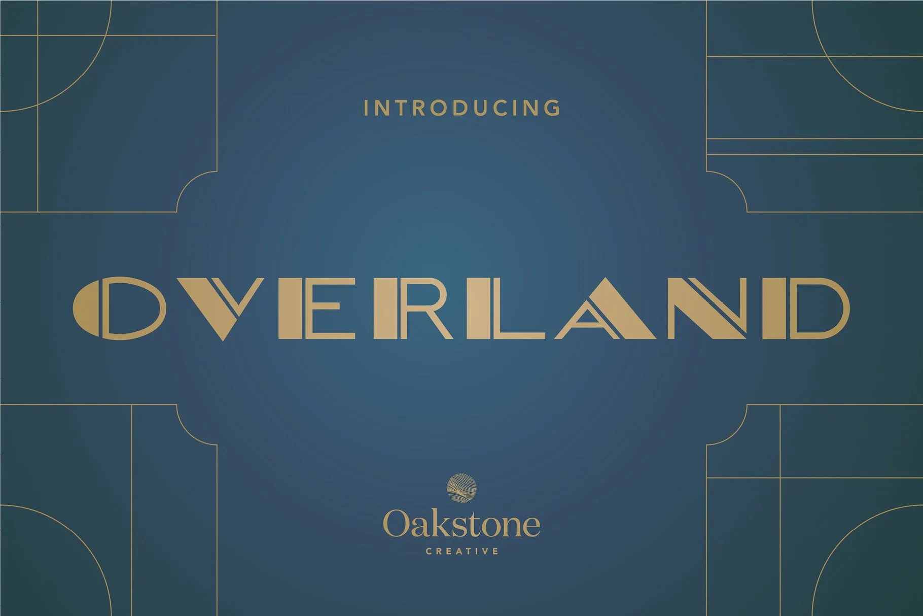
OC Overlander
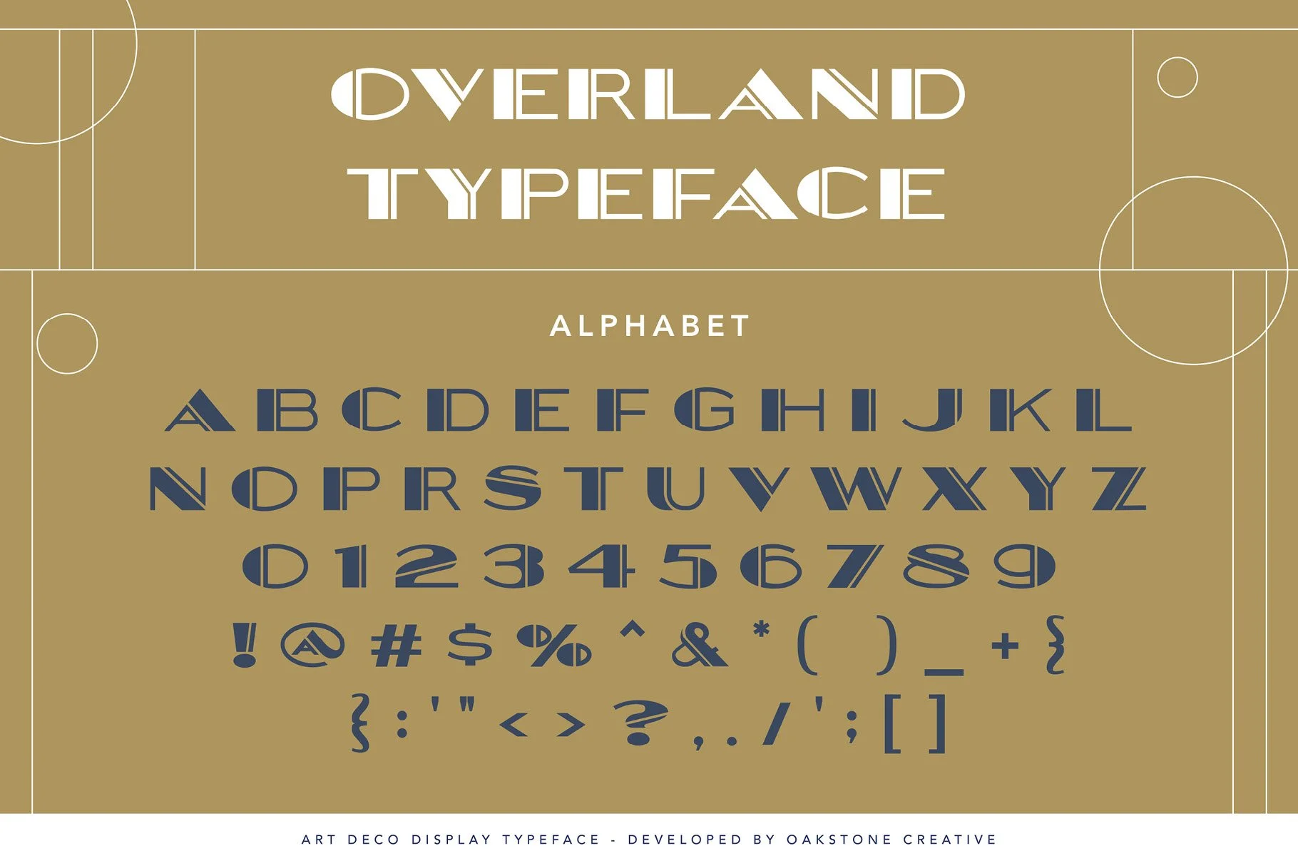
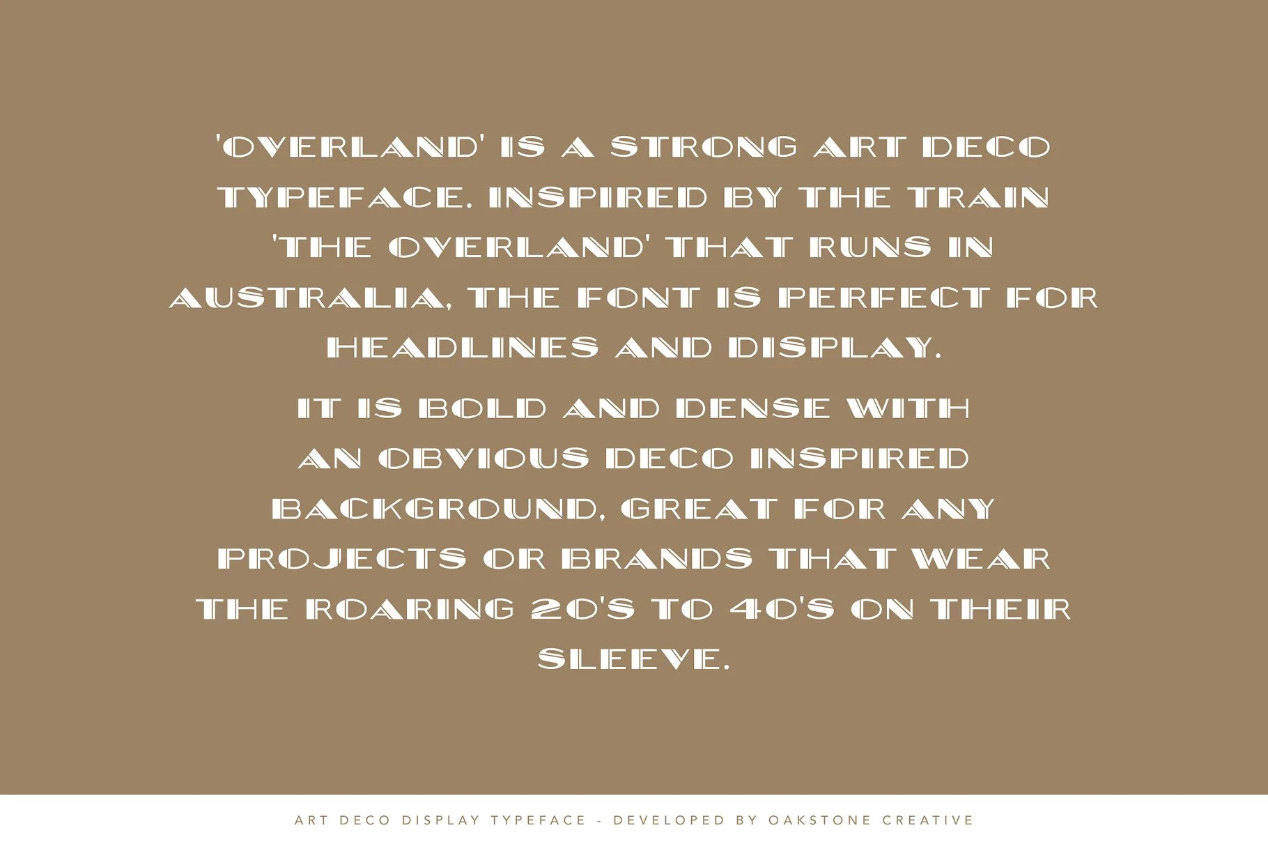
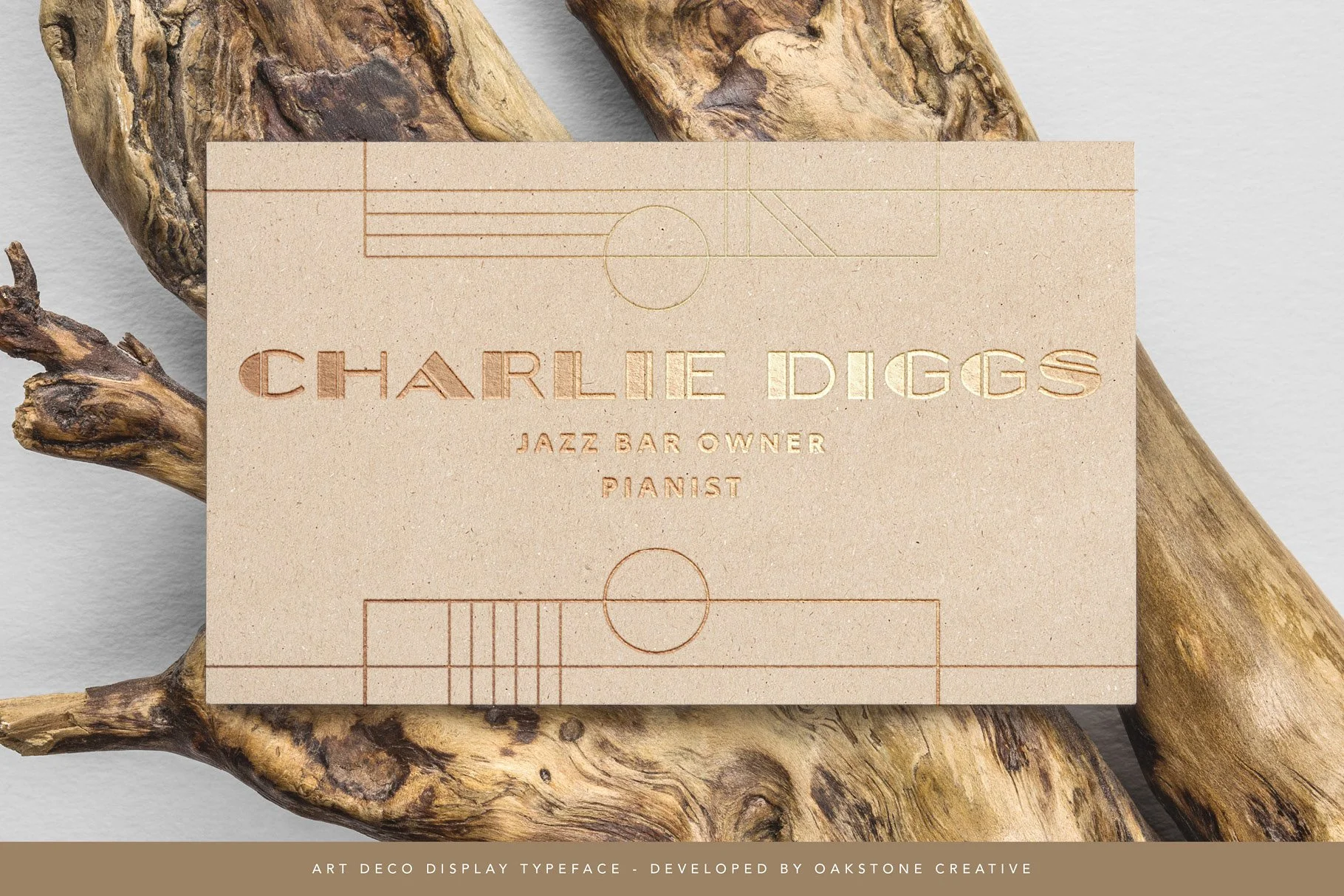
OC Overlander is a bold Art Deco display typeface shaped by the elegance of 1920s travel and the architectural drama of the golden age of rail. Inspired by vintage railway posters, jazz-era signage, and streamlined modernism, it captures a sense of movement, optimism, and refined spectacle.
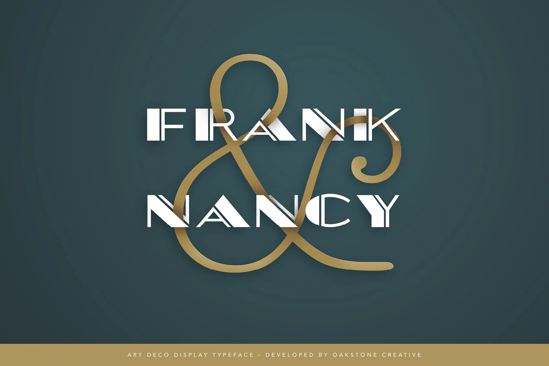
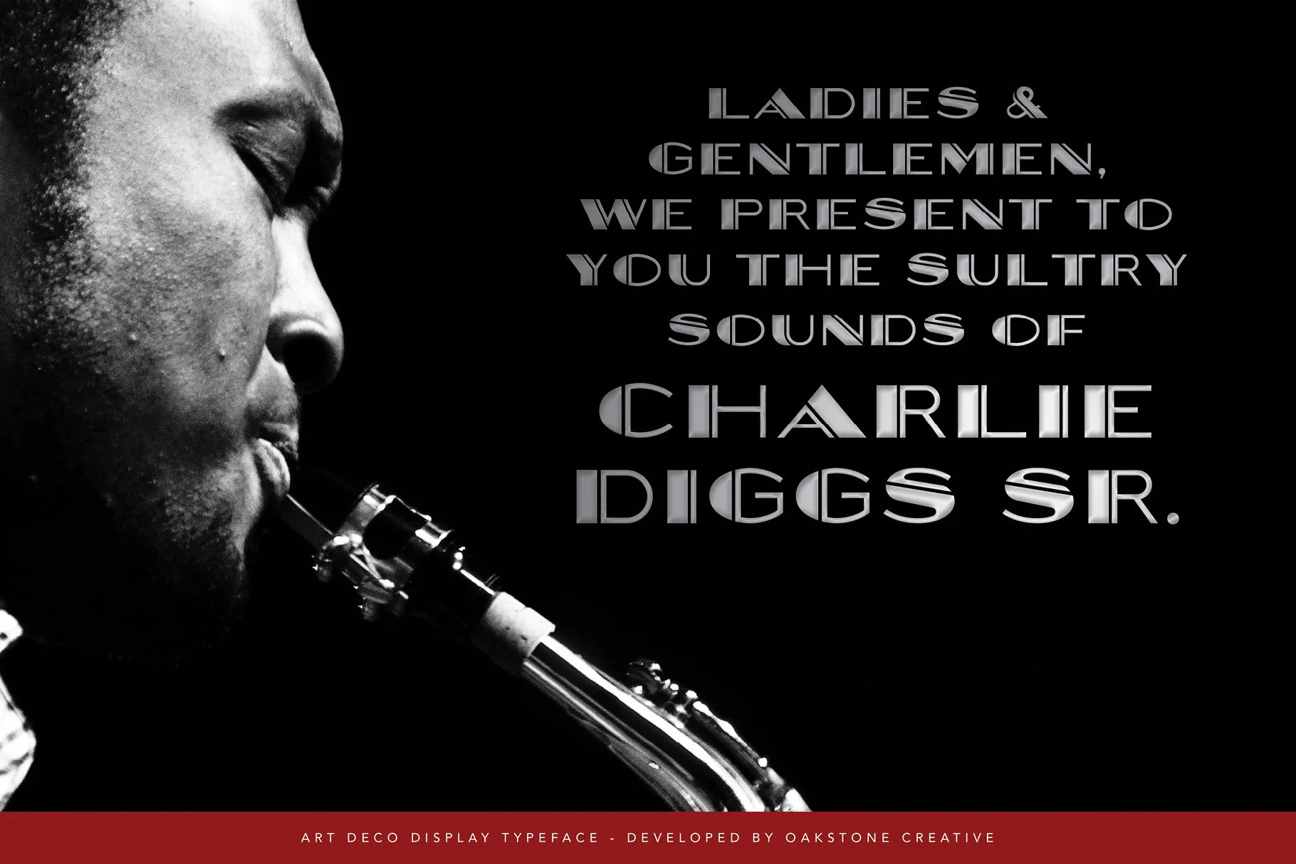
Built in striking all-caps letterforms, Overlander balances sharp geometry with graceful curves. The structure is confident and composed, delivering strong vertical presence while maintaining clarity and rhythm across headlines and branding applications.
Ideal for designers seeking a dramatic yet polished typographic voice, Overlander is well suited to brand identities, editorial layouts, packaging, hospitality concepts, posters, and vintage-inspired visual systems.
A display typeface designed to evoke momentum, glamour, and timeless sophistication.